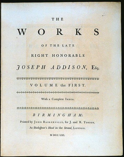
Typography exists to honor content.
Like oratory, music, dance, calligraphy – like anything that lends its grace to language – typography is an art that can be deliberately misused. It is a craft by which the meanings of a text (or its absence of meaning) can be clarified, honored and shared, or knowingly disguised.
In a world rife with unsolicited messages, typography must often draw attention to itself before it will be read. Yet in order to be read, it must relinquish the attention it has drawn. Typography with anything to say therefore aspires to a kind of statuesque transparency. Its other traditional goal is durability: not immunity to change, but a clear superiority to fashion. Typography at its best is a visual form of language linking timelessness and time.
One of the principles of durable typography is always legibility: some earned or unearned interest that gives its living energy to the page. It takes various forms and goes by various names, including serenity, liveliness, laughter, grace and joy.
These principles apply, in different ways, to the typography of business cards, instruction sheets and postage stamps, as well as editions of religious scriptures, literary classics and other books that aspire to join their ranks. Within limits, the same principles apply even to stock market reports, airline schedules, milk cartons, classified ads. But laughter, grace and joy, like legibility itself, all feed on meaning, which the writer, the words and the subject, not the typographer, must generally provide.
In 1770, a bill was introduced in the English Parliament with the following provisions:
...all women of whatever age, rank, profession, or degree, whether virgins, maids, widows, that shall ... impose upon, seduce, and betray into matrimony, any of His Majesty's subjects, by the scents, paints, cosmetic wahes, artificial teeth, false hair, Spanish wool, iron stays, hoops, high heeled shoes [or] bolstered hips shall incur the penalty of the law in force against witchcraft ... and ... the marriage, upon conviction, shall stand null and void.
The function of typography, as I understand it, is neither to further the power of witches nor to bolster the defences of those, like this unfortunate parliamentarian, who live in terror of being tempted and deceived. The satisfactions of the craft not from deluding the unwary reader by applying scents, paints and iron stays to empty prose. But humble texts, such as classified ads or the telephone directory, may profit as much as anything else from a good typographical bath and a change of clothes. And many a book, like many a warrior or dancer or priest of either sex, may look well with some paint on its face, or with a bone in its nose.
I intend to include selections from this book regularly to remind us that just as attention to detail is important in good design, attention to every aspect of thinking is vital to our livelihoods. We stay aware to stay in control.


No comments:
Post a Comment