

There is a dizzying array of typefaces available to designers. Whether bought, stolen, donated or actually free, there are myriad sources from which to acquire typefaces. But which ones are the right ones? Different designers stand by different versions of different typefaces. All we have is our varying literature, design forums and sources of instruction from which we can gleen a sense of which typefaces are the purest representation of the original cut, the most emphatic reinterpretation or the most iconic modern rendition.
Many rely on Robert Bringhurst's book (cum type-bible), The Elements of Typographic Style for all type-related advice. Some turn to the jedi-esque council on Typophile for a more democratic opinion, though most of its members are inherently purists. Some choose for themselves, and this can have a variety of results ranging from inspired to disastrous.
Ultimately, typography is intended to do justice to the message it is communicating. All of our classical typefaces and some newer ones were created to serve specific purposes. Whether it be for headlines or body text, to deliver a range of weights for multi-dimensional information architecture, or to display legibly in web situations, they have a reason for being. Many typefaces come in a cascade of versions because they have been hosted by different foundries over the years. Nowadays, there are people who are just obsessed with typography and draw horrendous, unstudied typefaces all day long. To purists, this is type-heresy of the highest order. But who's to stop the defamers? All a designer can do is be educated enough to choose and use the right typefaces.
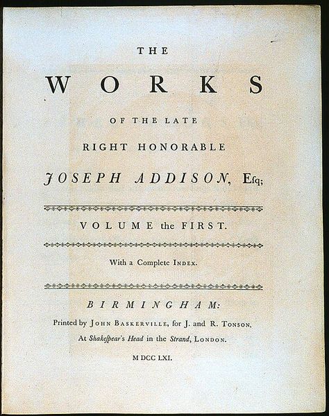
Garamond is a great example of a historic typeface with a hundred and one renditions that have been drawn throughout the ages. There isn't an original, honest-to-goodness, Claude Garamond cut of Garamond that we use on our computers today. But according to Bringhurst, the three adaptations worthy of note are Stempel Garamond, Adobe Garamond, and Granjon.
It should be noted that Berthold Garamond is strong and carefully tooled, but seems stiff and lacks the poetry of the three mentioned above. And though Garamond 3 has its moments, it can be a bit awkward and unruly. Then there are Ludlow Garamond, American Garamond, Italian Garamond and ITC Garamond, all of which are difficult to look at.
The great Jan Tschichold drew Sabon in 1964. It is extremely reverent to the idea of Garamond, and very true to its forms. And it is exquisite in its own right.
But more forms are constantly generated. For example, Karl Moller has taken it upon himself to review past versions of Garamond and create a version that is ideal for setting Swedish text.
Michael Bierut has a lot to say about ITC Garamond and new typefaces. One particularly astute observation is that unlike new architecture (which is usually met with initial disgust and then slowly accepted over time), new typefaces are typically received with zeal but then wear out and lose their hold on our interest. Of course, there are typefaces which have been around for centuries and look as fresh now as they ever have. Several appear here in a great survey of serifed text faces.
What begins to become apparent is that typefaces are more like philosophies than shapes. They have applications which dictate their appearance and give rise to their personality. But down the road, their personalities dictate their uses. They seem to grow up and their uses and experiences become inextricable aspects to their character.
It is of the highest importance that designers know the history of the language they employ. One does not speak without knowing the words, or else the meaning is lost. Likewise, a designer shouldn't communicate without understanding the typographic nuances and visual cues that are manifest in their executions.
By learning as much as we can and staying informed, we elevate the discipline of design to its highest point, where science and art synchronize.
No comments:
Post a Comment